Keeping a home clean, stylish, and easy to manage can feel overwhelming—especially when you’re juggling daily responsibilities. If you’re searching for practical home care strategies, smart cleaning techniques, and interior ideas that actually work in real life, you’re in the right place. This article is designed to give you clear, actionable guidance that simplifies maintenance, refreshes your spaces, and helps you create a home that feels both functional and inviting.
From room-specific cleaning methods to daily upkeep routines that prevent mess from piling up, we focus on solutions you can apply immediately. You’ll also discover styling insights, including how to incorporate earthy color palettes to create warmth and balance throughout your rooms.
Our guidance is built on hands-on experience, proven home care practices, and thoughtful organization strategies that prioritize efficiency and comfort. Whether you’re tackling deep cleaning or refining your décor, you’ll find practical tips you can trust and use right away.
Bring the Outdoors In
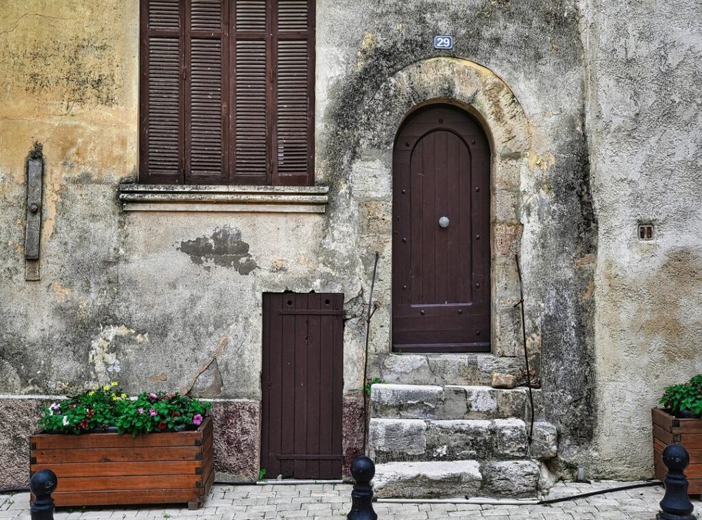
Modern homes can feel oddly sterile, like a showroom that forgot people actually live there. Meanwhile, nature is outside doing its thing with soil, stone, and sea. So why not borrow its color playbook? By using earthy color palettes inspired by clay, river water, and weathered rock, you can create rooms that feel grounded, calm, and timeless. However, some argue neutrals and bright whites keep spaces clean and modern. Fair point. But too much white can feel like you are living inside a blank spreadsheet (and unless you are Excel, that is a bit sad), honestly.
The Grounding Force: Palettes from Soil and Clay
As you explore how earthy color palettes can create warm and inviting interiors, don’t forget to consider practical aspects of homeownership, like understanding home insurance basics to protect your new space – for more details, check out our Understanding Home Insurance Basics for New Homeowners.
There’s a reason designers keep returning to earthy color palettes. Browns drawn from soil and clay—deep umber, rich terracotta, soft beige, and warm sienna—mirror the natural world. Psychologically, these tones signal stability and comfort. Studies in color psychology suggest warm neutrals can promote relaxation and a sense of safety (Kaya & Epps, 2004). In other words, they make a room feel like an exhale at the end of a long day.
Some argue browns feel outdated or too heavy. (Yes, the ‘90s overdid it.) But the issue isn’t the color—it’s balance. When layered thoughtfully, these hues create depth rather than darkness.
Practical applications:
- Terracotta as a warm accent wall in a living room
- Beige as a versatile main wall neutral
- Deep brown sofas or wooden tables to anchor the space
Texture makes the palette sing. Pair these shades with:
- Natural wood finishes
- Worn leather
- Woven textiles like linen and jute
The result feels grounded, not gloomy—more cozy cabin than cave. Pro tip: add soft lighting to prevent deeper browns from absorbing too much light. Done right, these tones don’t weigh a room down—they hold it together.
Blues and greens borrowed from oceans and rivers have a quiet power. From muted seafoam and misty atmospheric tones to deep navy and slate grey, this palette mirrors water in all its moods. Lighter hues—think pale aqua or washed sage—tend to slow the heart rate and encourage relaxation, a response supported by color psychology research (Küller et al., 2009). In contrast, saturated navy and charcoal blues introduce drama and sophistication, wrapping a room in a cocoon-like depth (the design equivalent of a cashmere throw).
So what’s next after choosing your shade? Start with placement. In bedrooms, a deep navy accent wall behind the bed creates an enveloping, cozy effect, while seafoam green walls in a bathroom instantly suggest spa-like calm. Then consider materials. Light woods such as birch or ash keep the look airy, marble surfaces enhance the fresh, water-washed feel, and brushed nickel or chrome add a cool gleam.
If you love earthy color palettes, blend in sandy beiges or stone accents for balance. Pro tip: test paint samples at different times of day; natural light dramatically shifts blue undertones. Finally, layer soft textiles to prevent the scheme from feeling cold and to maintain that restorative serenity indoors year-round.
The Enduring Strength: Tones from Stone and Minerals

The power of stone-inspired interiors lies in their restraint. Think cool granite grey, soft limestone white, and deep slate charcoal—core tones drawn directly from the earth. Threaded through these shades, subtle mineral veining in gold or copper adds quiet luxury (like nature’s own pinstripe suit). This palette defines modern minimalism: clean, grounded, and effortlessly sophisticated.
These colors create a strong, neutral foundation that lets architectural details and textures take center stage. Instead of competing for attention, beams, moldings, and statement lighting stand out with clarity.
Some argue greys and charcoals feel cold or impersonal. That can happen—if texture is ignored. The key is balance. Pair polished stone countertops with raw concrete, brushed metal, or soft wool throws to prevent sterility. A charcoal kitchen with limestone white walls feels sleek, while copper faucets or gold fixtures introduce warmth and depth.
Ideal applications include:
- Sleek charcoal kitchen cabinetry with polished stone surfaces
- Limestone white walls in home offices for focused calm
- Slate accents layered with wool rugs in minimalist living spaces
This approach works beautifully alongside earthy color palettes, especially when planning layouts and smart furniture choices for small and multifunctional spaces (https://mrshometips.com/smart-furniture-choices-for-small-and-multifunctional-spaces/). Pro tip: mix matte and polished finishes to add dimension without adding clutter.
The 60-30-10 Rule in Real Life
I’ll admit it—when I first tried refreshing my living room, I overdid the accent color (think terracotta overload). Eventually, I discovered the 60-30-10 rule, a simple design formula where 60% of a room is a dominant color, 30% a secondary shade, and 10% an accent. For example, imagine 60% in a soft limestone white on the walls, 30% in a grounding slate grey sofa and rug, and 10% in warm terracotta through cushions and art. Suddenly, the space feels balanced instead of chaotic.
However, color alone isn’t enough. The real magic happens with texture. Wood grain, stone finishes, wool throws, cotton curtains, and even a few live plants add tactile depth. Without texture, even the most beautiful earthy color palettes can fall flat (like a stage set without actors).
Then there’s lighting. Natural light keeps these shades airy during the day. By contrast, warm 2700K bulbs in the evening enrich the tones and create a cozy glow.
If you’re hesitant, start small. Create a mood board first. Or swap in new pillows and a throw blanket. Low commitment, big impact—and far fewer regrets.
Your Home, Rooted in Timeless Style
Decorating with earthy color palettes is not about chasing trends; it is about choosing colors drawn from nature that feel steady and familiar. In simple terms, this approach uses hues you would see outdoors—clay, moss, sand, stone—to build harmony indoors. Why does that matter? Because natural tones quietly calm the nervous system (think of how you exhale at the beach).
These colors solve the problem of impersonal rooms by:
- Creating warmth without clutter
- Connecting your space to the natural world
For your next update, pick a favorite landscape photo and let it guide every shade you choose inside.
Create a Living Room That Finally Feels Like Home
You started this journey looking for ways to make your living room feel warmer, more inviting, and easier to maintain. Now you have practical styling ideas, smart layout tips, and simple updates—like layering textures and using earthy color palettes—to transform your space without overwhelming your budget.
A living room that feels cold, cluttered, or disconnected can quietly drain your energy every day. But with the right design choices and consistent upkeep, you can turn it into a space that feels calm, functional, and beautifully put together.
Don’t let indecision or outdated décor keep you stuck. Start with one small change today—refresh your color scheme, rearrange your layout, or deep clean one key area. If you want step-by-step home care strategies and proven styling ideas trusted by thousands of homeowners, explore more of our expert tips now and create a space you’re proud to come home to.
 Home Care Specialist & Operations Manager
Steven Washingtonavilo writes the kind of useful stuff content that people actually send to each other. Not because it's flashy or controversial, but because it's the sort of thing where you read it and immediately think of three people who need to see it. Steven has a talent for identifying the questions that a lot of people have but haven't quite figured out how to articulate yet — and then answering them properly.
They covers a lot of ground: Useful Stuff, Daily Home Maintenance Tips, Room-Specific Cleaning Techniques, and plenty of adjacent territory that doesn't always get treated with the same seriousness. The consistency across all of it is a certain kind of respect for the reader. Steven doesn't assume people are stupid, and they doesn't assume they know everything either. They writes for someone who is genuinely trying to figure something out — because that's usually who's actually reading. That assumption shapes everything from how they structures an explanation to how much background they includes before getting to the point.
Beyond the practical stuff, there's something in Steven's writing that reflects a real investment in the subject — not performed enthusiasm, but the kind of sustained interest that produces insight over time. They has been paying attention to useful stuff long enough that they notices things a more casual observer would miss. That depth shows up in the work in ways that are hard to fake.
Home Care Specialist & Operations Manager
Steven Washingtonavilo writes the kind of useful stuff content that people actually send to each other. Not because it's flashy or controversial, but because it's the sort of thing where you read it and immediately think of three people who need to see it. Steven has a talent for identifying the questions that a lot of people have but haven't quite figured out how to articulate yet — and then answering them properly.
They covers a lot of ground: Useful Stuff, Daily Home Maintenance Tips, Room-Specific Cleaning Techniques, and plenty of adjacent territory that doesn't always get treated with the same seriousness. The consistency across all of it is a certain kind of respect for the reader. Steven doesn't assume people are stupid, and they doesn't assume they know everything either. They writes for someone who is genuinely trying to figure something out — because that's usually who's actually reading. That assumption shapes everything from how they structures an explanation to how much background they includes before getting to the point.
Beyond the practical stuff, there's something in Steven's writing that reflects a real investment in the subject — not performed enthusiasm, but the kind of sustained interest that produces insight over time. They has been paying attention to useful stuff long enough that they notices things a more casual observer would miss. That depth shows up in the work in ways that are hard to fake.